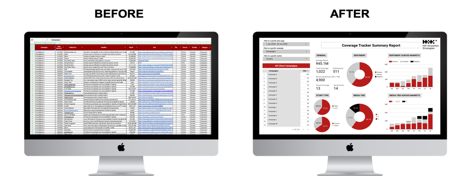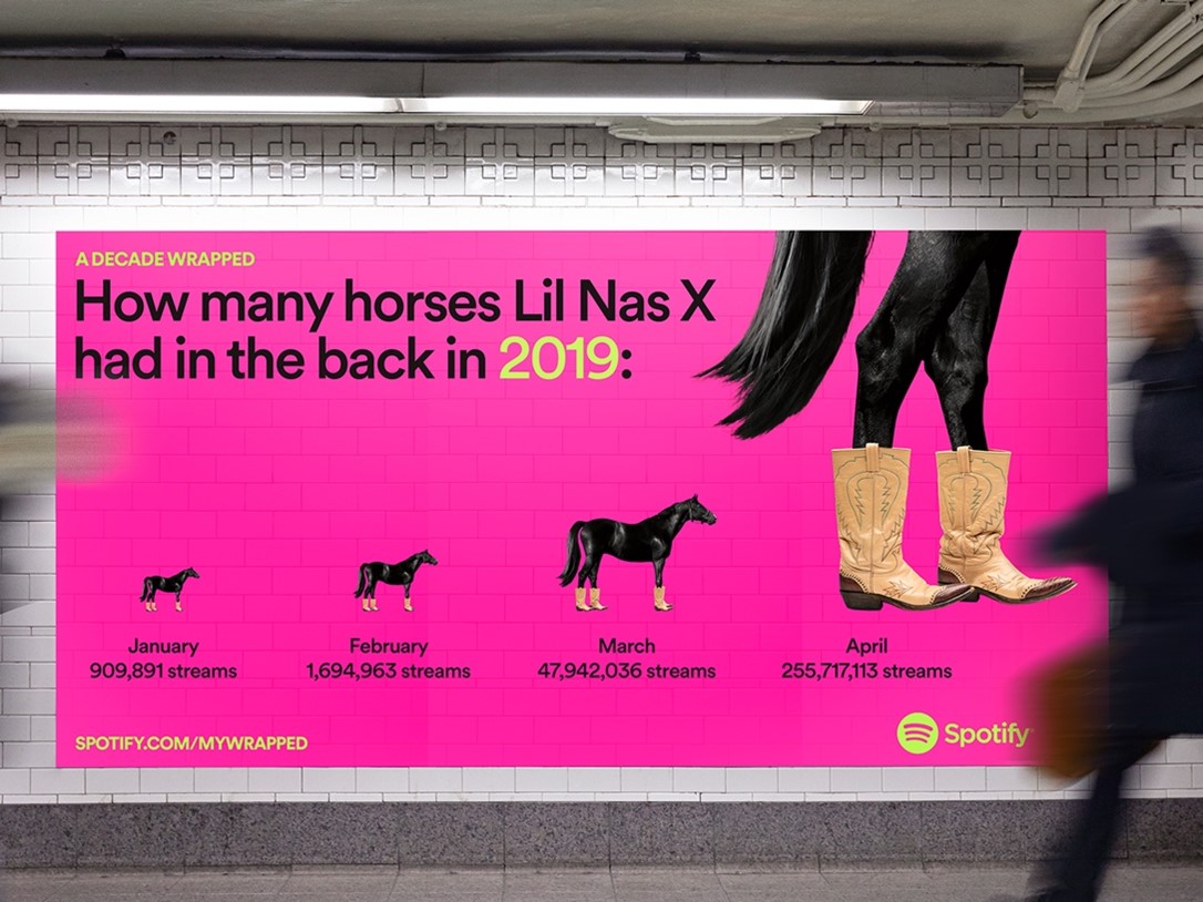
With its yearly Wrapped campaign, Spotify is a prime example of a brand using data visualization to create impactful communications campaigns, drawing consumers into their world.
Multiple studies have concluded that the human brain is wired to absorb visual content 60,000 times faster than text-based data.
Human beings process data visually and emotionally. The ability to create a relatable narrative around the story data tells, allows us to connect with it on a human level and link it back to scenarios and realities that are familiar to us. Storytelling comes in to make sense of the figures in a way that reflects our lives and environment. Visualizing that data into context is what we’ve done since the dawn of time to understand the world around us. With data becoming more complex, the need to simplify and contextualize it, has only gotten greater.
What is data visualization?
It’s a way for people to process complex information in a way that is familiar to them, through storytelling. While technology, information sources and data might change, we won’t. That’s why data visualization plays a significant role in presenting analyses, findings or concepts in ways that is understandable and relatable.